

Stryd Insights
CLIENT
Stryd, 2020
ROLE
Product Design, UI Design, Data Visualization
PLATFORM
Native apps (iOS and Android)
TEAM
Stryd software team members
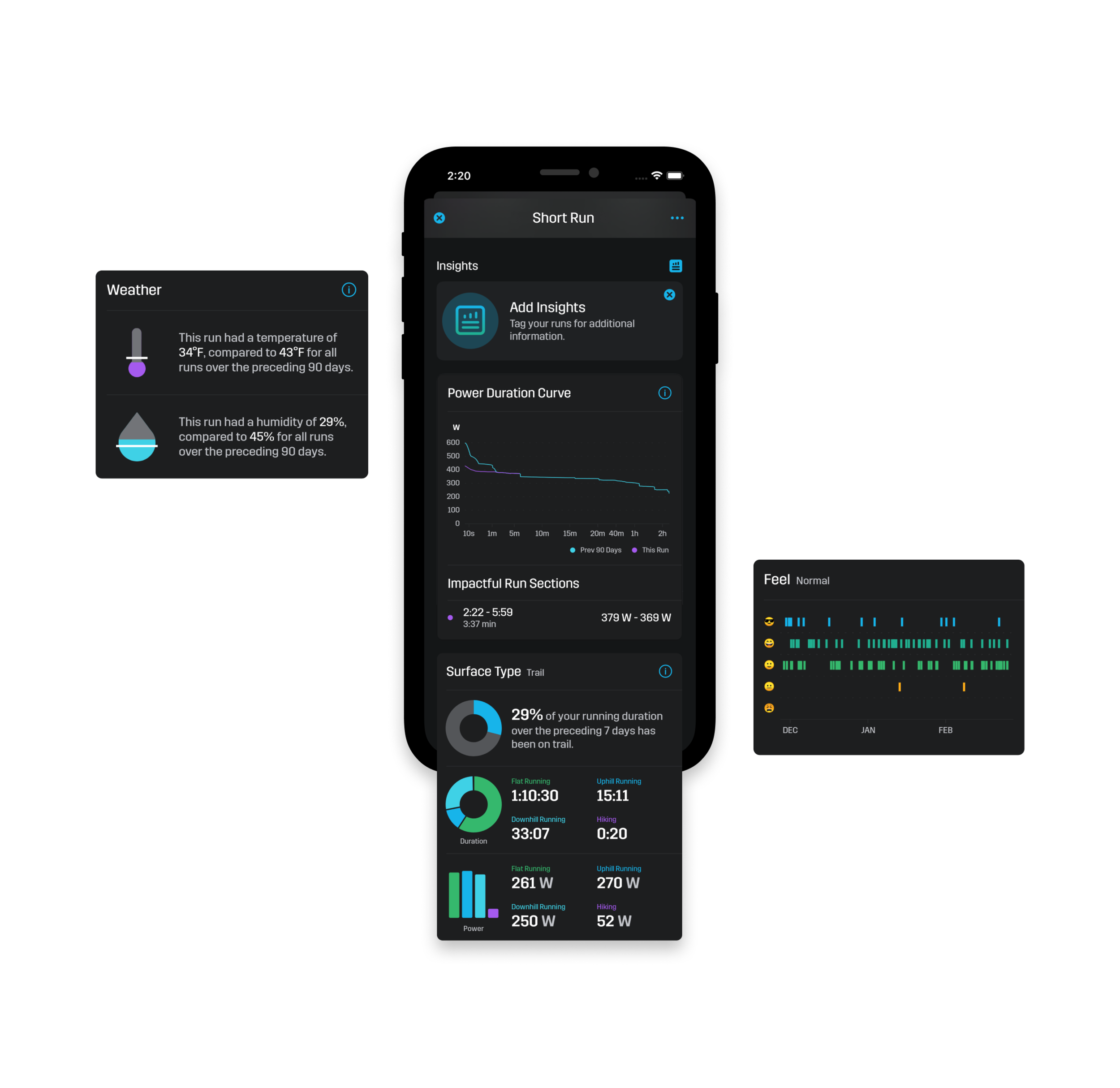
Stryd pod is a power based running meter, and paired with your smart watch, the app gives you run training guidance to help you improve your performance and continually build on your gains.
As a UI Designer I helped design the post-run insight cards, which are provided to the user after a run if they tag their runs. Tagging your runs provides the Stryd app with data that can be analyzed, providing you with trends and insights into your running performance. The Post-Run Inights include Weather, Time In Zones, RPE (Running Perceived Effort), Surface Type, Recovery, Run Type, and Power Duration Curve Insights.

THE CHALLENGE
We wanted the post run insight cards to match the other data visualization designs (complement them consistency wise), as well as more graphically showcase your running insights. Instead of them all being line charts or pie charts, there needed to be diversity of visualizations, but also visual consistency and an overall visual system. The visualizations needed to be easily understood at a glance, and lend to future insights.


THE APPROACH
The insight cards (originally just on iOS, but now also on the Android app) were designed by expanding upon current designs, and doing some research into data visualization design. I tried a couple different options for each of the insights, and working side-by-side with the mobile developers, we came to solutions. After some feedback from the beta community, we adjusted some items and then released to all users. We will continue to add additional insights, as well as update these according to the community’s needs.


